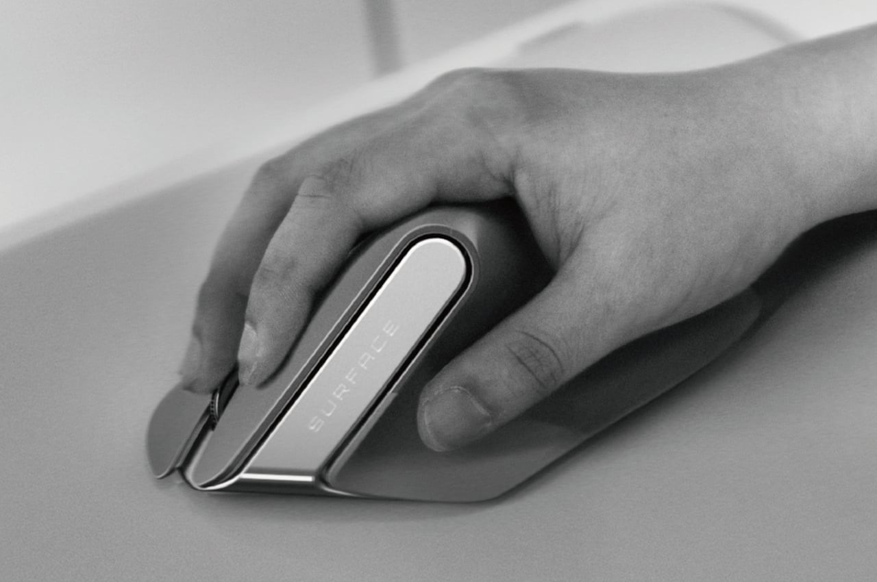
Sticking to a familiar product design carries some benefits, such as inspiring confidence that you don’t have to retrain your brain on how to use the product. At the same time, though, it also carries a risk of making a product stagnate and refusing to fix flaws in the design for fear of the unknown. The tech industry has many examples of these, particularly with things like keyboards and mice that are critical to using computers. The mouse, in particular, hasn’t seen a major redesign every since its conception, even if its core form has been known to lead to wrist injury over time. It’s probably time to rethink ye olde mouse design into something that takes into account today’s needs, just like this take on an ergonomic mouse that looks nothing like your typical mouse.
Designer: Dongjun Choi
Ever since it was first unveiled in 1964, the fundamental design of the computer mouse hasn’t changed significantly. You still have a block-like shape with buttons on top and a mechanism underneath for moving the screen cursor. A few more buttons have been added on top or on the sides, but the core design has remained the same. Unfortunately, the same ergonomic problems that lead to repetitive strain injuries have also become a constant for all but the most unorthodox mouse designs.
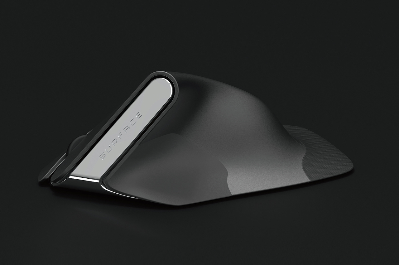
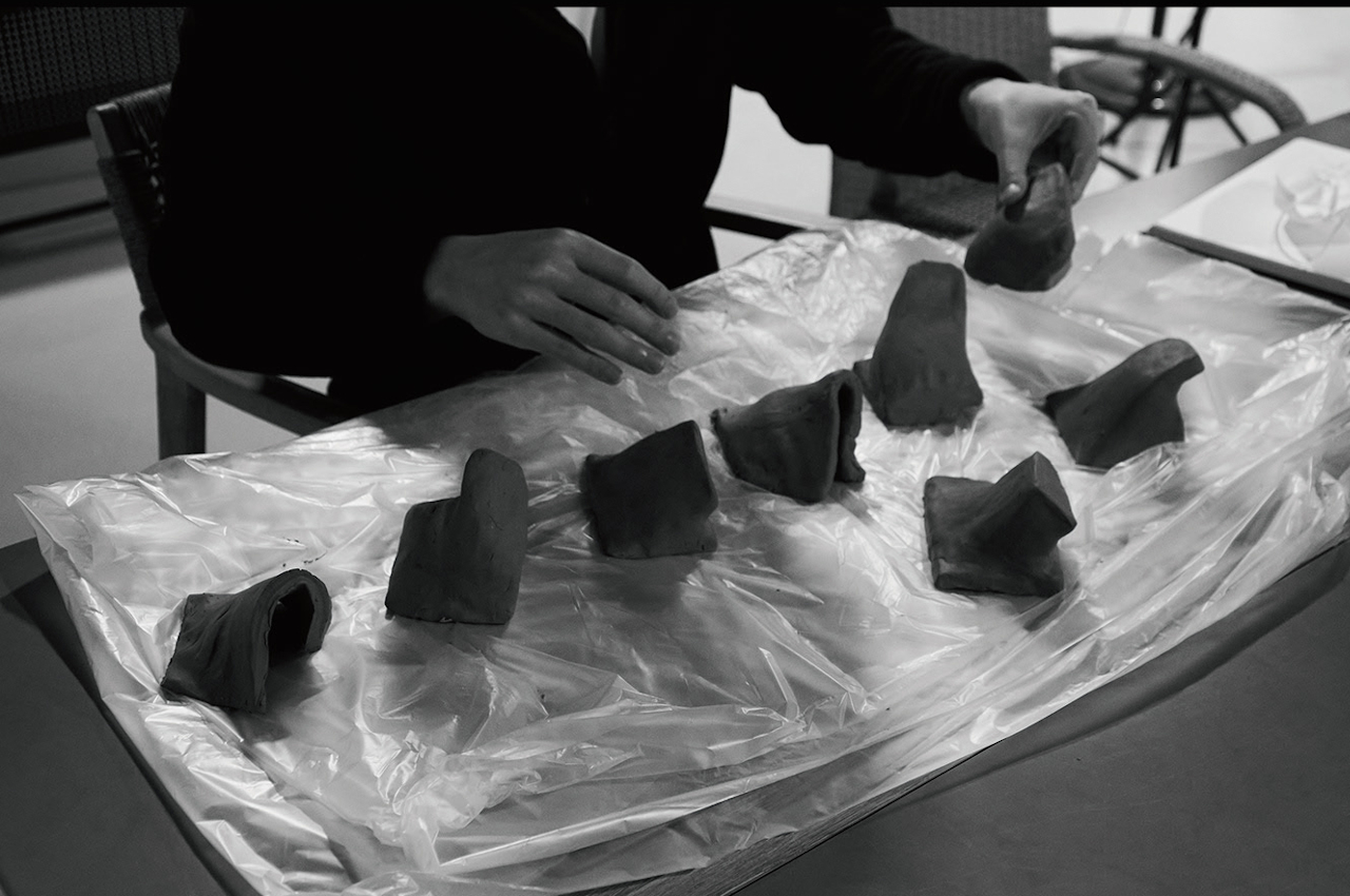
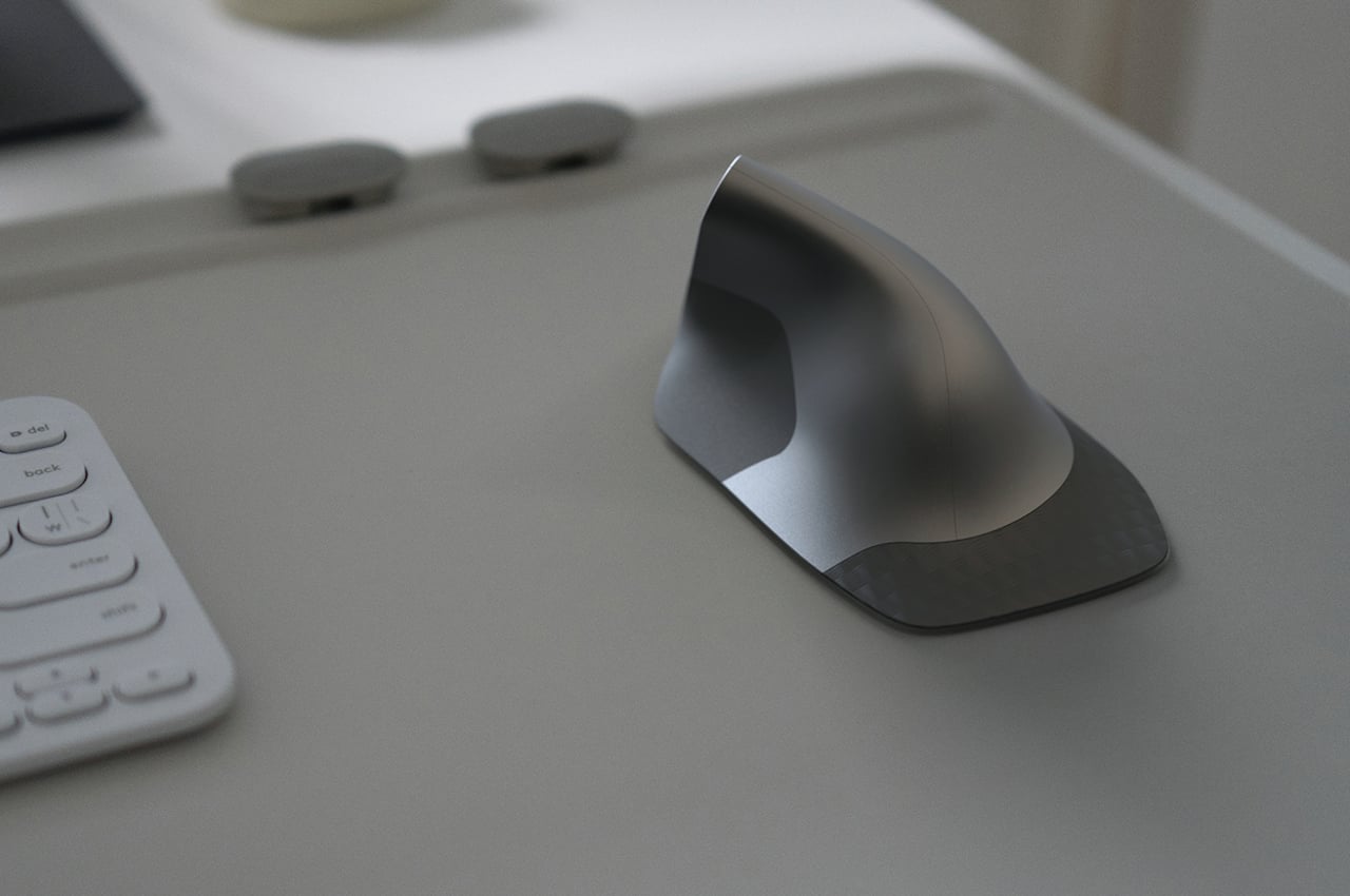
Although almost everyone knows there are problems and limitations to this design, the industry still sticks to it because it is so familiar to people today. There are, fortunately, a few creative minds that dare to imagine something better that takes into account the lessons of the past decades. This concept, for example, takes into account the hand’s natural position, which is more vertical than the horizontal position that common mice force our hands into.


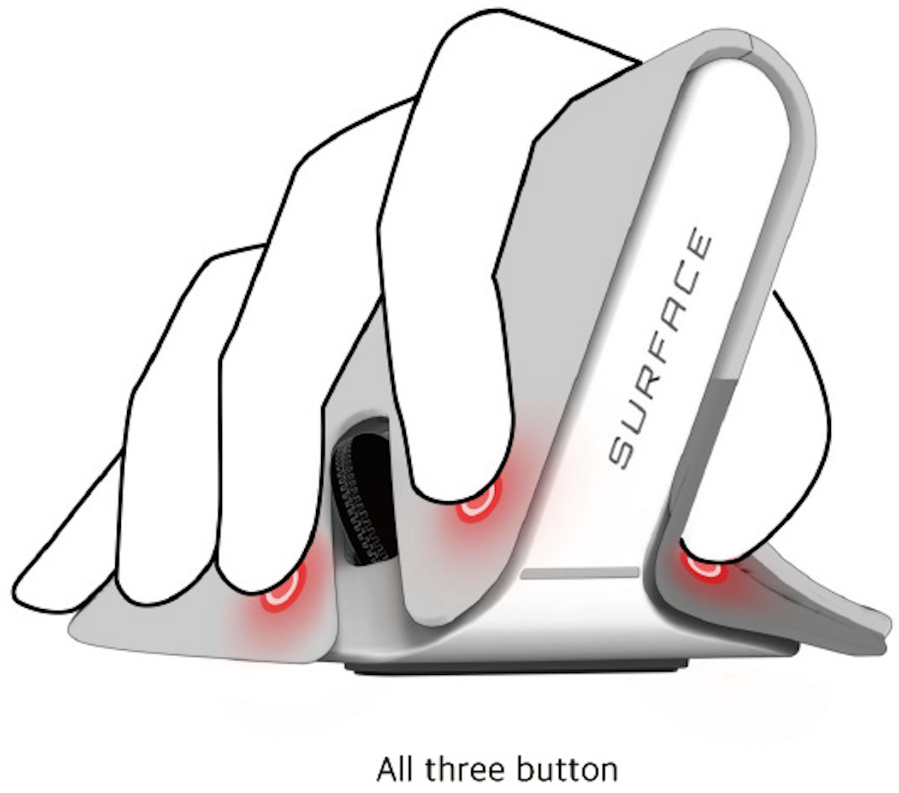
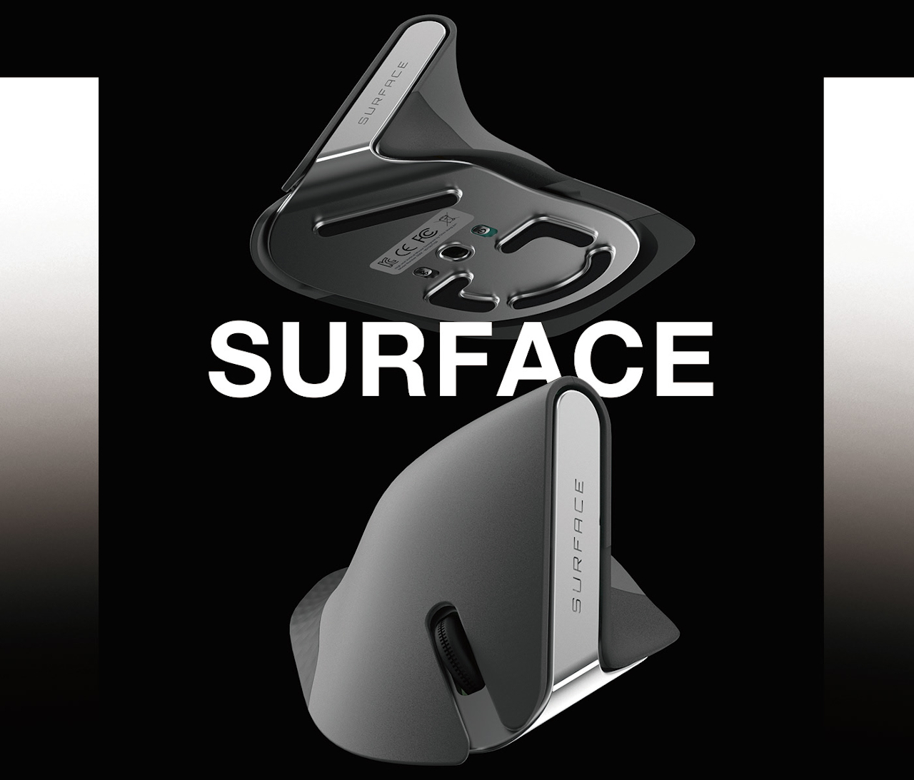
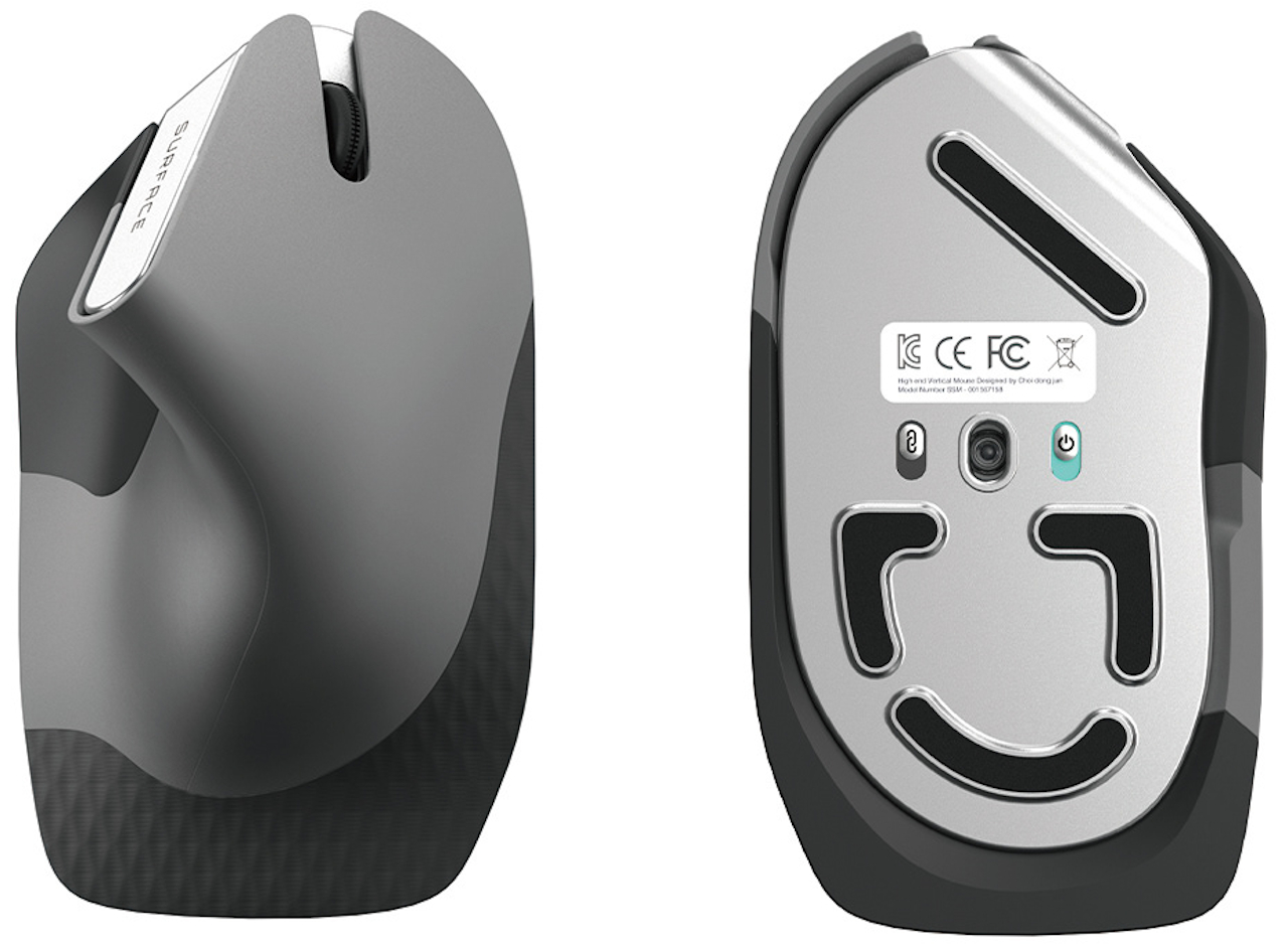
Given how we’ve been conditioned to use such mice for years, the design of this input device is admittedly alien and might even look awkward. You grip the elevated part of the device like a joystick, nestling the curve between your thumb and index finger. This idea is similar to a few other concept designs, suggesting there could really be something to this ergonomic form. What makes this design rather unique is the placement of buttons on the mouse, which is to say, there are no visible buttons at all.
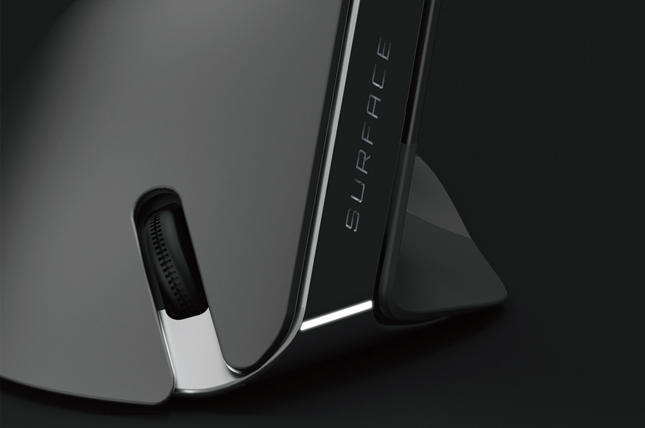
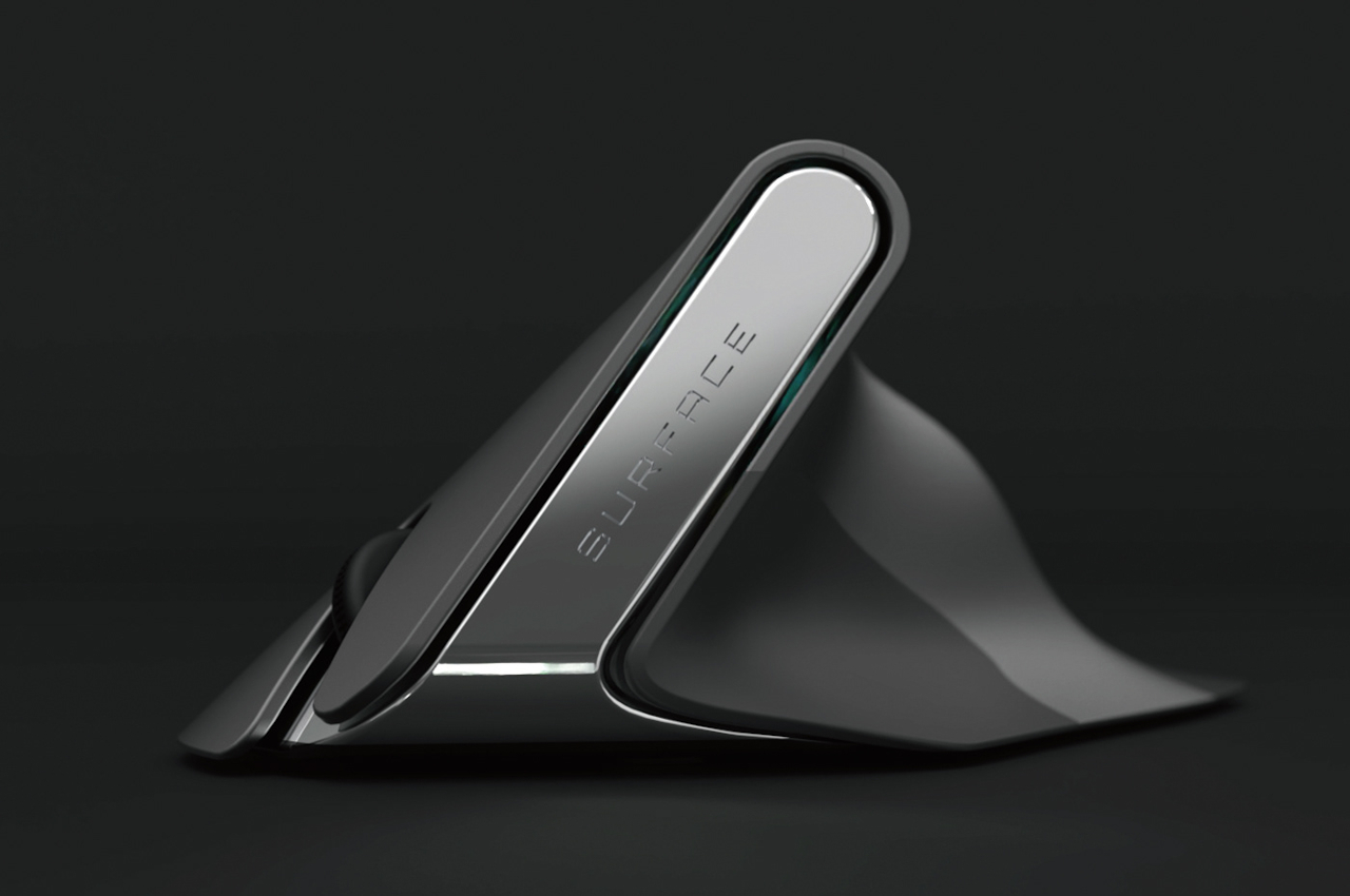
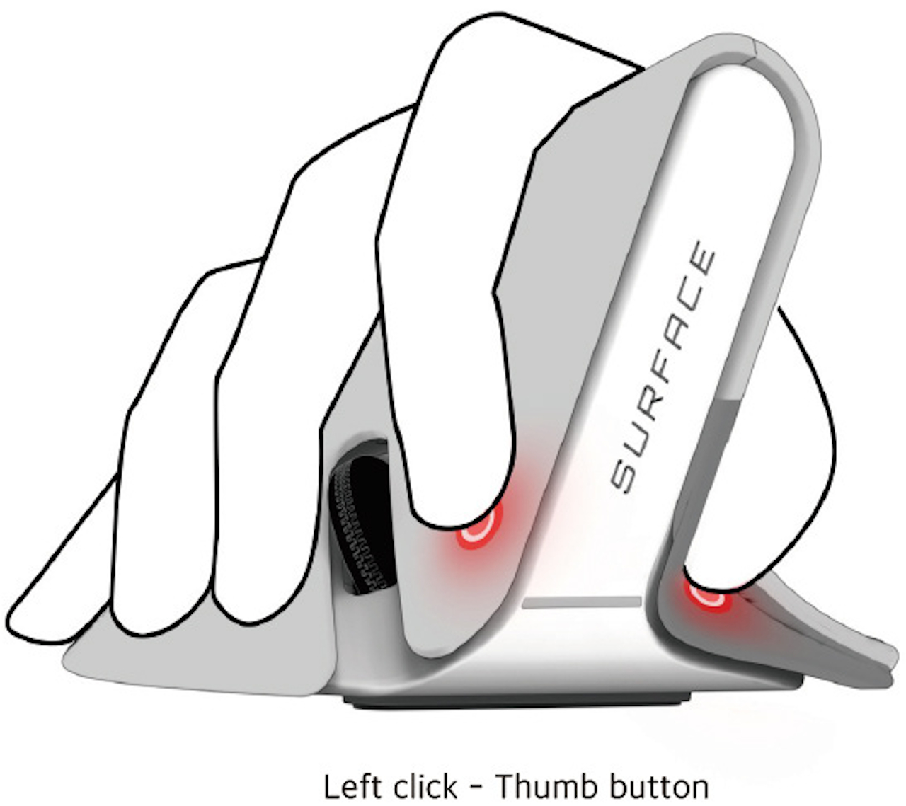
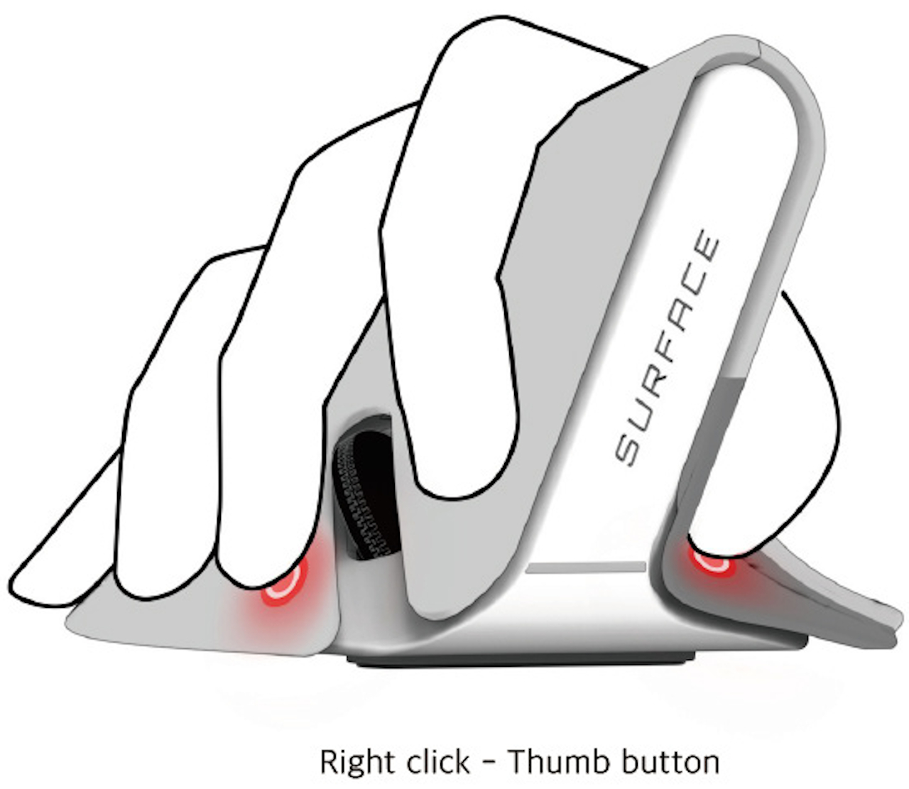
There are no distinct mouse buttons, but there are three pressure-sensitive areas where the thumb, index finger, and middle finger would normally rest. Rather than being mapped to the typical left, right, or middle buttons, the mouse relies on gestures instead. A pinch would correspond to a left click while pressing the thumb and middle finger could be a right click. There’s also the option to press all three areas, which could be configured to act as the middle button.
The concept design still relies on the same optical technology used by today’s mice, so you’ll still have to move your hand around the desk to move the cursor. That, unfortunately, could still lead to injury and also needs to be addressed as well. In the ideal future, we probably wouldn’t need mice or even keyboards anymore, but that would be an even bigger leap compared to simply changing the mouse’s design today.
"traditional" - Google News
August 28, 2022 at 12:30PM
https://ift.tt/vdh91ny
This ergonomic mouse concept tries to break free of traditional designs - Yanko Design
"traditional" - Google News
https://ift.tt/fd7VXaH
Shoes Man Tutorial
Pos News Update
Meme Update
Korean Entertainment News
Japan News Update
Bagikan Berita Ini


0 Response to "This ergonomic mouse concept tries to break free of traditional designs - Yanko Design"
Post a Comment