The freshest style in decor these days is ... mixing styles.
Traditional and contemporary often work well together. Think abstract art with an overstuffed chaise, or an 18th-century-style toile wallpaper with an '80s-era lamp. The appeal is in the pleasing tension between the styles; sophisticated, artsy, yet livable.
The latest throwback trend comes, as usual, from pop culture. Binge-worthy TV series like "Outlander" and "Bridgerton" have inspired Pinterest boards filled with tartan pillows, William Morris patterns, stag antler lighting, copper soaking tubs, silver candlesticks and daybeds. Wave a feathered fan at "Regencycore."
What "Mad Men" did for midcentury modern, these recent period series have done for early 19th-century aesthetics, characterized by elements such as tufted sofas, oversize mirrors, chandeliers, gilded accents, and colorful floral or Oriental prints.
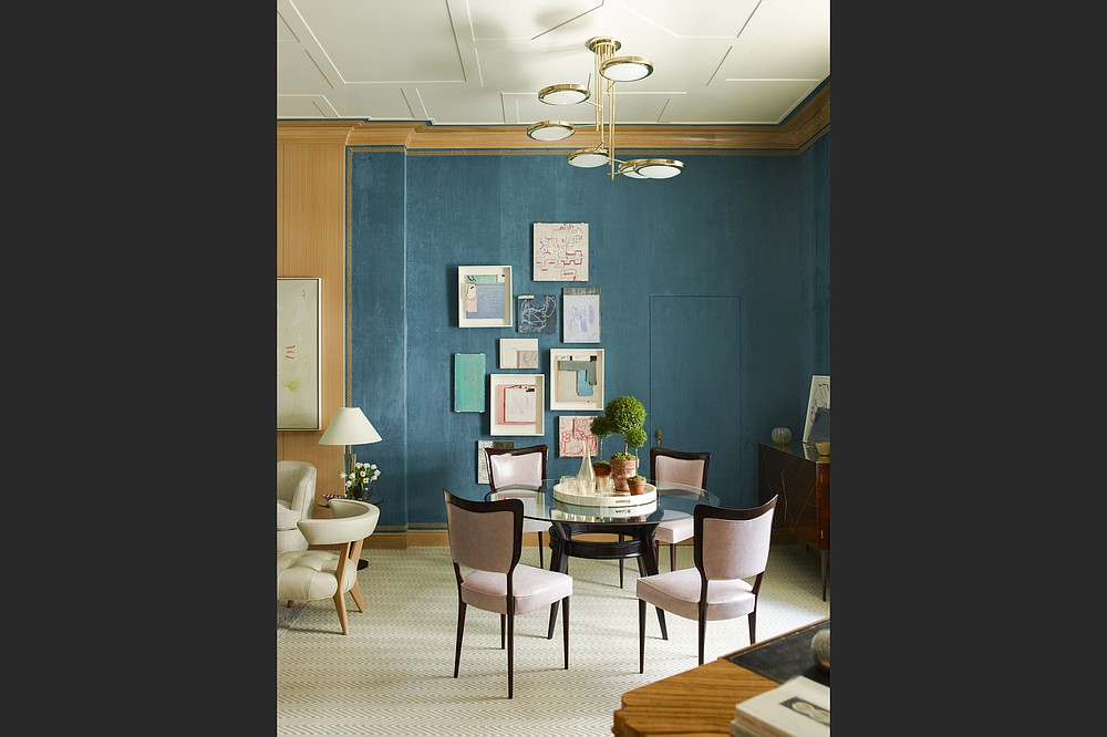
Modern elements temper the fussiness of frills and furbelows while showcasing their features and allow you to create personal spaces that aren't stuck in a single style.
"It's always a balancing act finding the right amount of each character to include in a room," says Cynthia Byrnes, founder of a New York-based online art gallery and curation business. "Some wouldn't recommend placing a heavy baroque French console table underneath contemporary photography.
"But if the scale, colors and architecture complement each other, then anything is possible."
KEEP WHAT'S COOL
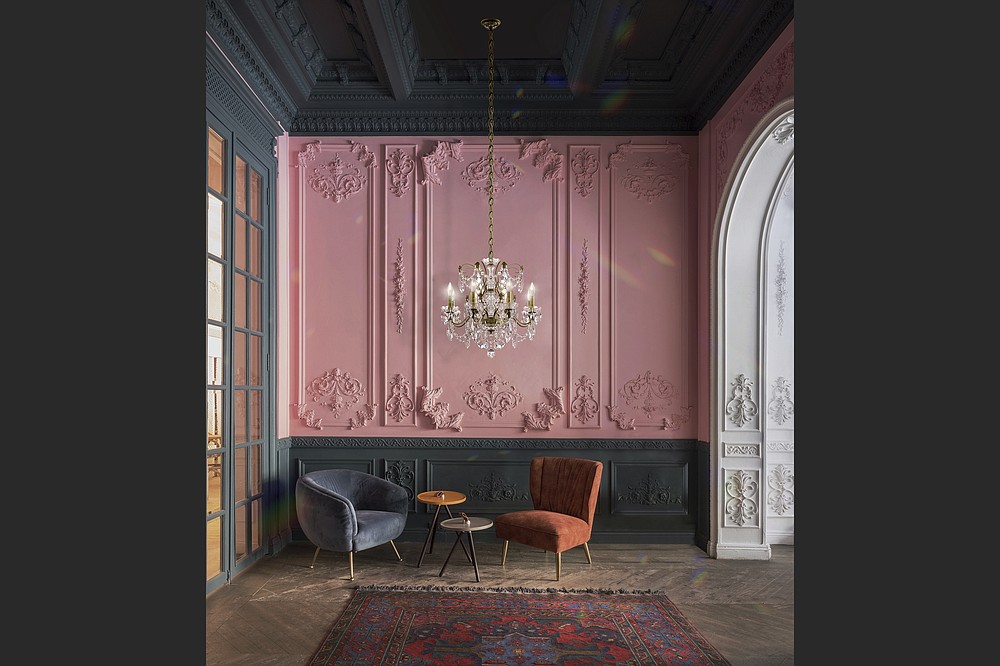
Designers aren't keen to raze every "old" feature in a project. Rather than stripping rooms back to the studs, they're often retaining original architectural details and then adding modern elements and furnishings.
Claire Paquin of Clean Design Partners in Scarsdale, N.Y., brought pops of au courant berry, salmon and ebony into a freshly whitened Tudor living room via curvy modern seating, throw cushions and artwork, but kept the gracious beaded-glass bay windows.
In Brooklin, Maine, John Ike of the New York-based design firm Ike Kligerman Barkley bought the former Order of Odd Fellows building, updating the 1895 structure but keeping many exterior and interior features. The third-floor living space has the original painted ceilings, moldings and deeply seated windows, but Ike has filled it with contemporary Italian furniture, a tube lighting sculpture from Kartell, and reproductions of Ico Prisi panels found at a street market. The modern elements serve to highlight the historic elements rather than diminish them.
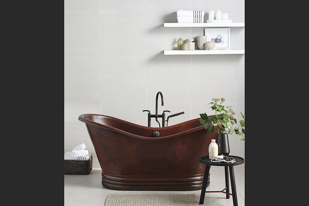
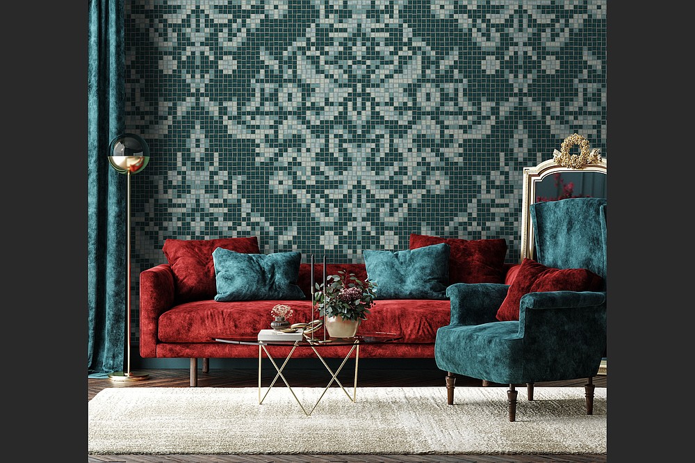
If you're tackling your own renovation and want to introduce a period element, consider adding damask-patterned tile to a backsplash or feature wall; Artaic's Dramati glass mosaic is worth a look. Native Trails has a hand-hammered copper soaking tub, which Daphne Bridgerton would surely have enjoyed.
Chandeliers are having their own moment as part of this trend; look for traditional clear glass, or go for it with an all-black version of Schonbek's Hamilton chandelier, or House of Hampton's multi-colored one.
DETAILS, DETAILS
In his West Palm Beach, Fla., showroom, designer Jim Dove placed de Gournay's L'Eden wallpaper, with an enchanting forest scene, behind a protective sheet of glass. L'Atelier Paris' kitchen range adds another refined, French country house element; tailored white cabinetry, a sleek white worktop and luxe upholstered chairs keep it all looking modern.
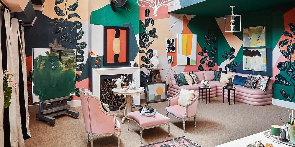
For her room at the 2019 Kip's Bay Show House, designer Young Huh paired a pillowy 18th-century Gustavian banquette with a hefty Italian marble-topped dining table and an antique wing chair. The walls brought everything into the present, however, with several pieces from Cynthia Byrnes' gallery, and Fromental's large-scale, Cubist-inspired Braque wallpaper. The finished room is sophisticated and playful.
Byrnes says there's a trick to getting this look right.
"When you're mixing contemporary art with period furniture, it's important to consider the scale and character of each piece," Byrnes says. "There are certain periods and styles of antique furniture that flow easily with contemporary artworks. Like the clean lines, marble and airy gilding of Swedish Neoclassical pieces. Classical Chinese Ming-style huanghuali furniture; and, here in Young's show-house space, the sophisticated grandeur of 18th-century French bergeres."
Brittney Herrera, interior designer and founder of the online shop Wildwood House, in Portland, Ore., suggests: "Pairing a modern table lamp in a moody hue with a traditional area rug in the same tone will create an expertly curated look steeped in style. Outfitting a room with traditional artwork, a contemporary version of a 17th-century caned chair, or an avant garde dining table not only adds interest but depth as well."
AL FRESCO IDEAS
The front yards and backyards too can benefit from blending styles, says Miami-based landscape designer Fernando Wong.
"I always try to mix contemporary with traditional," he says, citing one project where he used "a vintage rattan furniture set from Bonacina, one of Italy's oldest furniture makers, bought at auction from the estate of Brooke Astor, and paired it with a beautiful new drinks cart from McKinnon & Harris. Throw in some majestic French Anduze urns from a garden antiques store like Authentic Provence, and you are onto something pretty great."
Kim Cook writes frequently for The AP about design, decor and lifestyles topics. She can be found on Instagram at kimcookhome and reached at kimcookhome.com.
"traditional" - Google News
September 04, 2021 at 01:40PM
https://ift.tt/2VdS5Wr
Balancing act: Mixing traditional with contemporary decor - Arkansas Online
"traditional" - Google News
https://ift.tt/36u1SIt
Shoes Man Tutorial
Pos News Update
Meme Update
Korean Entertainment News
Japan News Update
Bagikan Berita Ini


0 Response to "Balancing act: Mixing traditional with contemporary decor - Arkansas Online"
Post a Comment